Letters from the Industry
Editor’s Note: In our Letters from the Industry series, we ask professionals in the food business to share experiences and insight from their individual worlds. Cookbooks are an indispensible part of culinary culture, often providing impetus, instruction and inspiration for many of the folks who prepare our food and shape the future of the way we cook and consume. At Ten Speed Press in Emeryville, California, Senior Editor, Emily Timberlake, takes us through an average week-in-the-life of someone who helps bring these beautiful books to market.
As it turns out, cookbook editing involves far less bar- and restaurant-hopping, and far more schedule-wrangling and Microsoft Word wizardry than I’d originally hoped. Still, one of the things I love best about my job at Ten Speed Press is that every day is different. As Senior Editor, I am responsible for acquiring and editing ten to twelve books per year, on subjects ranging from wine to fried chicken, Basque food to barbecue (I’m still waiting for the magical book that combines all four).
This of course means that I’m constantly switching gears as I move from project to project––one day, I’m immersed in the world of Italian-made bittersweet liqueurs (amari); the next, I’m researching comparative and competitive titles for a prospective burger cookbook.
On average, illustrated cookbooks take about two years to make: one year to write, then one year to edit, photograph, design, print and ship. Of course, this doesn’t even factor in the months it takes for an author to refine an idea, find an agent, create a proposal, pitch publishers and negotiate a contract––or the months post-publication spent marketing, promoting and selling. Books are long-lived creatures!
So in a given week I work on a number of different projects, each in a different phase of its publishing lifespan––concept development, acquisition, editing, photographing, design and production among them. What follows is a Frankensteined diary of my typical workweek. I say “Frankensteined” because, well, like the rest of us, I spend hours and hours staring at screens, checking emails and in meetings––daily chores that merit no elaboration.

Monday.
Rather than heading to the office this morning, I hop onto BART and go straight into San Francisco. A potential author––a bartender––is passing through town and wants to meet. We grab a cup of coffee and chat about her bar, her favorite cocktail books and her ideas for a book of her own. It’s a great meeting and I leave feeling quite inspired. Hopefully, the feeling was mutual, and our conversation will help her shape a book proposal that will work well for Ten Speed.
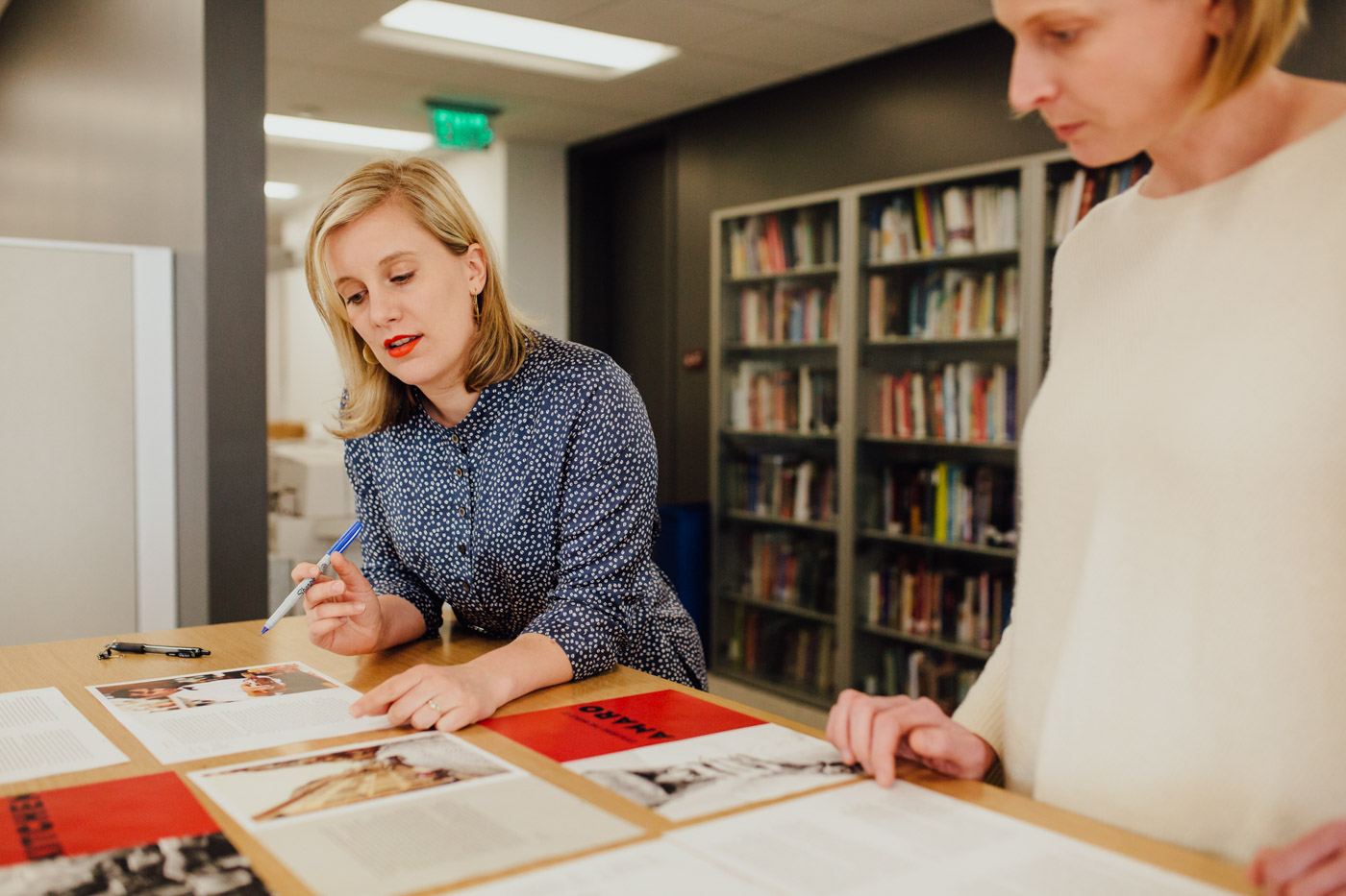
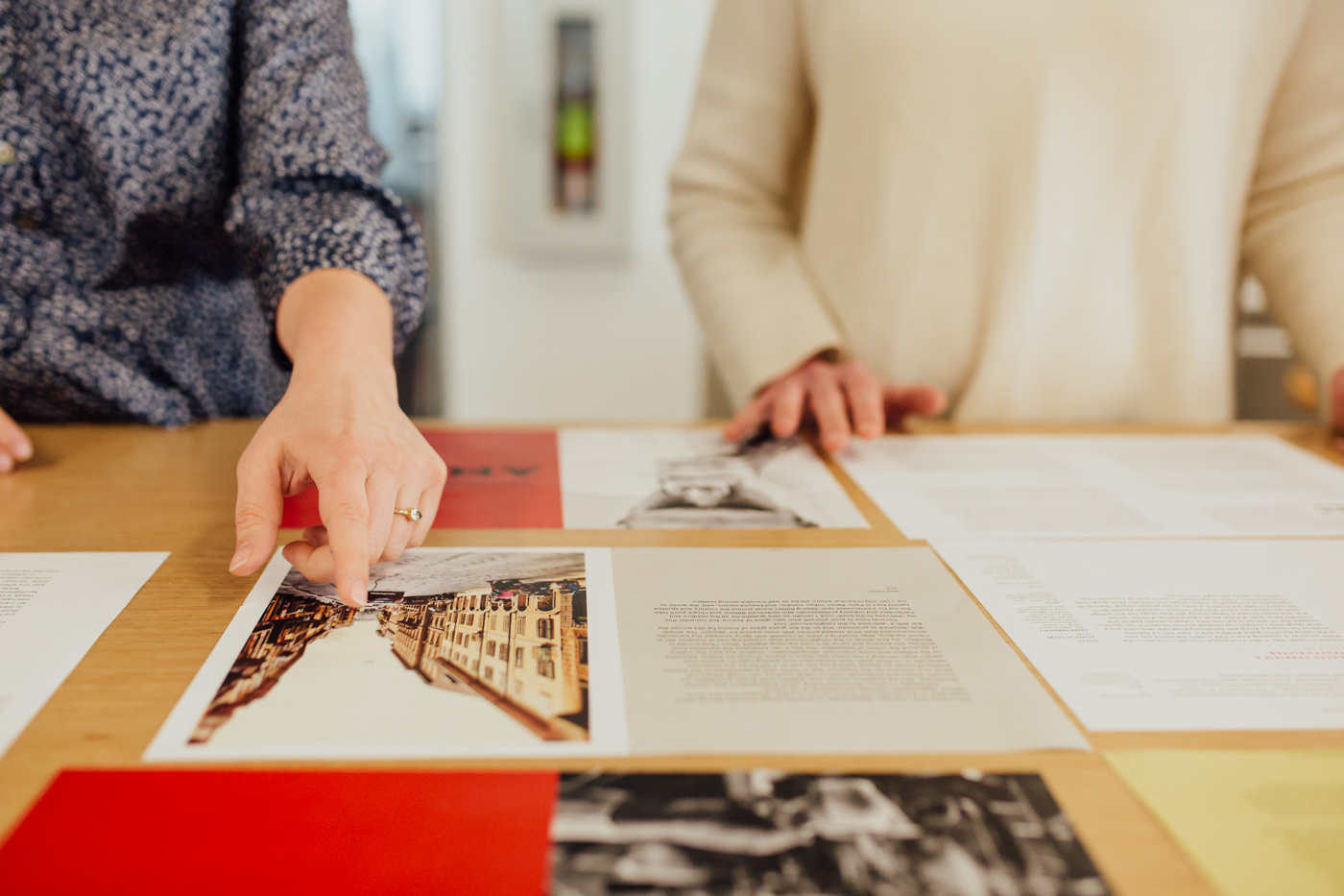
Back in the office, I meet with one of our crackerjack art directors, Kara, to discuss the sample design she’s been working on for a pizza cookbook I acquired. Kara and I agree that the design should nod to the author’s first book, which Ten Speed published a few years ago––cookbooks are collectibles, after all––but also incorporate some new elements. One chapter of the book is dedicated to dough recipes, each of which features metric weights, imperial volume conversions and baker’s percentages. It’s a lot of information––all necessary, all useful––but how do we best display it in a way that doesn’t seem intimidating or complicated?
Kara shows me a few different options for tables she’s come up with. I immediately gravitate towards one––if there’s such a thing as a “friendly ingredients table,” this is it––but ask if she can divide the center column in two and bold the first sentence of each recipe step. Easy. Kara goes back to her desk to work on the tweaks; once the Ten Speed team is pleased with the design, we’ll share it with the author, make more tweaks if needed and once he approves, Kara can start laying out the full book.
Tuesday.
Another off site––two mornings in a row! In fairness, I should say that this isn’t the norm, but this morning I head about an hour north of our office to Petaluma, California, and the home of one of my favorite food photographers. The order of the day is a book cover: we’ve already wrapped the rest of the shoot (done on location in Mississippi); however, we still haven’t landed on a cover that everyone can agree on. We’re taking advantage of the author being in town to give it another try.
The photographer; author; art director, Betsy, and I huddle to discuss our game plan. The Ten Speed sales department has asked for a food photo that is gooey, craveable and, “food-porny.” The author, on the other hand, asks if we can please try something more unexpected, something that isn’t just pretty food on a pretty plate; the photographer agrees that this could be a more interesting direction (I sympathize with the author, photographer and sales department here—can’t we all just get along?).
Over the next four hours, we shoot several options of two different set-ups: one is a graphic, minimal shot of food cooking in a frying pan; the other a more conventional plated food shot, with plenty of gooey, craveable sauce. We all love the more graphic option, which strikes me as cool but also delicious-looking. As if to prove my point, the photographer starts eating the bacon from the shot. I guess that’s a wrap?
Betsy and I grab two forks and tear into the other plated dish. Pro tip: Always shoot real food. It looks better, and hey, free lunch.
Wednesday.
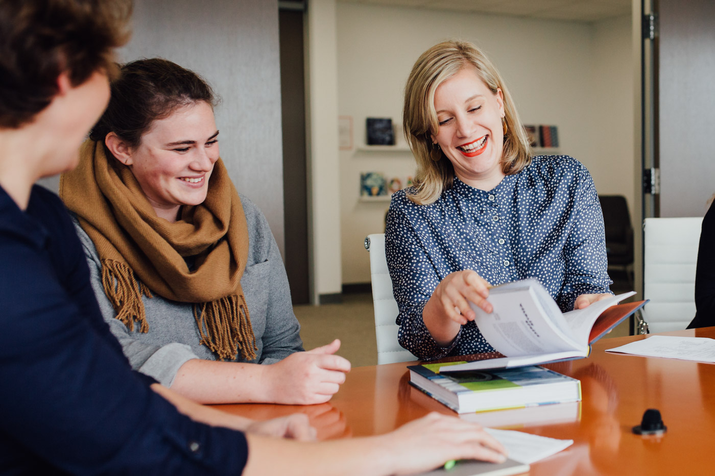
Time to make up for two days away from my desk with some serious computer-staring. Several weeks ago, I sent off a manuscript to one of our freelance copyeditors to complete a thorough line edit of the book. Prior to that, the author and I had spent about two months editing and revising the manuscript to get it ready for copyediting. This morning, the copyeditor returned the manuscript, which is now a rather daunting sea of red markup and highlighted queries. I review the revisions and send the document to the author. If he didn’t hate Microsoft Word’s Track Changes feature before, there’s a good chance he’s going to hate it now.
In my cover memo, I remind him that many of the changes were just to make the book adhere to Ten Speed’s long-established house style. However, he needs to pay attention to highlighted queries––for example, on page 99, he never tells readers how long they’re supposed to brown the meat, or when to add the paprika. I silently thank the heavens for sending us such thorough, meticulous copyeditors (they’re the real heroes, folks), and pray that the author doesn’t flip when he sees how much work is left to do.
My reverie is broken when another editor knocks on my door and tells me that one of my books is up at our weekly cover meeting. I walk over to the meeting area and the giant pin board where designers display options for each cover they’re working on. Today we’re discussing a book called All Under Heaven––a massive, 528-page tome that covers all 35 regional cuisines of China. The author, Carolyn Phillips, also happens to be a fabulous illustrator, and the book is filled with her beautiful line drawings.
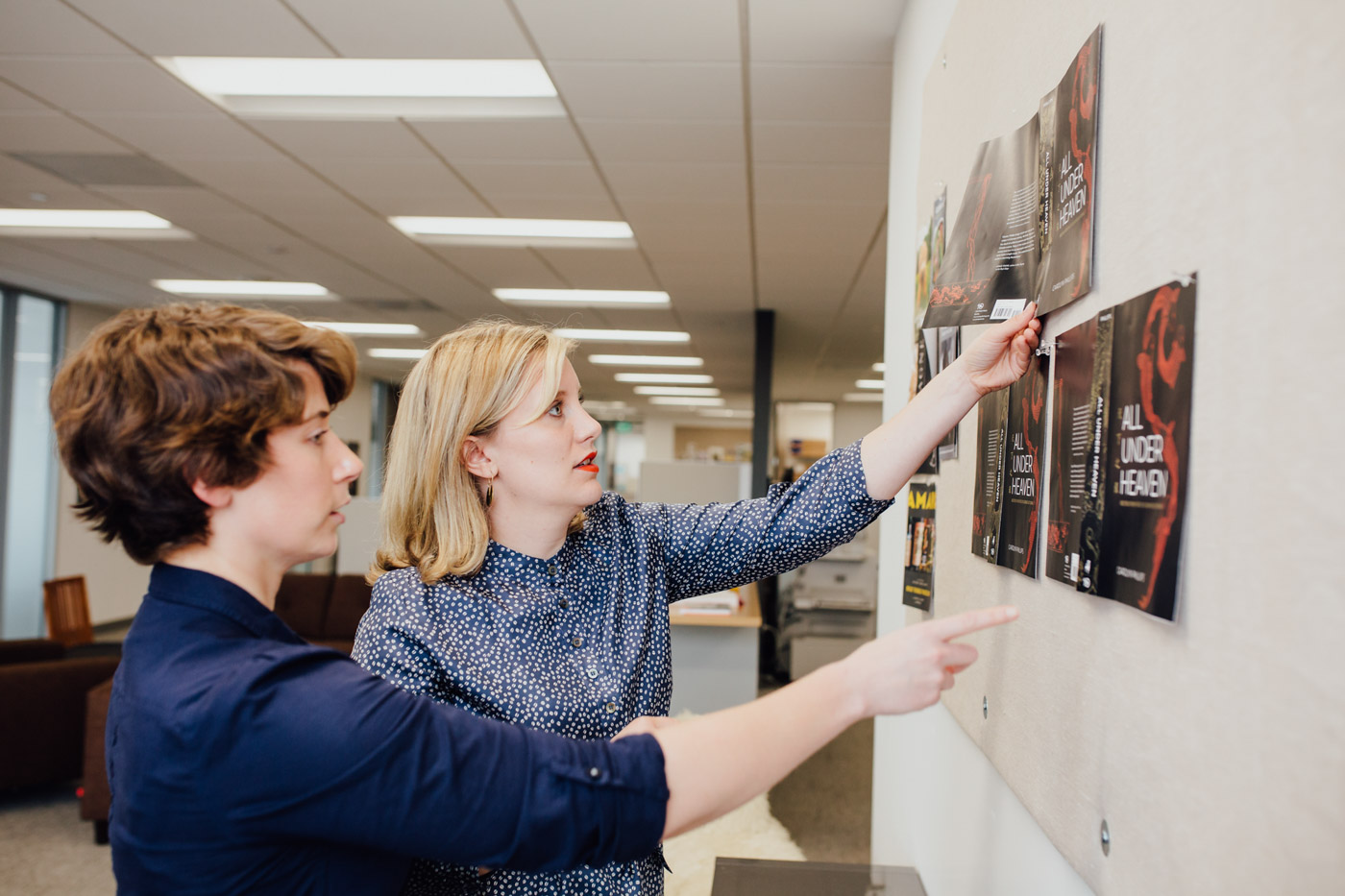
The mood in today’s meeting is a bit grim: we had already agreed upon a concept we loved––a striking fuchsia cover with an illustration of koi swimming up the side. However, earlier this week we got the dreaded email from sales: they don’t like the cover; it’s too subtle; it doesn’t scream, “Chinese cookbook.” Can we put a food photo on the cover? (No. There aren’t any food photos in the book.) Can we change the color scheme? Our art director, Ashley, pins some new black, red and gold variations on the board. I miss the fuchsia––but I have to admit, this new direction is really working. Our publisher, publishing director and creative director are getting excited, too. What if we hit the Chinese characters and subtitle with spot foil, to make them really pop? And what if we ask Carolyn to draw a bowl of noodles that fits in the negative space on the back cover, with the long noodles mirroring the movement of the fish on the front? Our production manager, Serena, chimes in to say that we should test the foil to make sure the line weight isn’t too thin and that registration won’t be an issue. We may have lost our pink cover––but this feels really promising.

Thursday.
Today is our weekly acquisitions meeting where editors pitch potential projects to our colleagues in the marketing, publicity, design and editorial departments. I’m so excited about the project I’m presenting, I can barely stand it. The author is a young, wickedly creative chef who I’ve been talking to for a couple of years. Now, she’s found a writer and a photographer and an agent and put together an incredible cookbook proposal. I know that I’m not the only one who’s interested––she’s a young, wickedly creative chef, after all––so I suspect there will be a competitive auction for the book. After my short, excitedly flustered presentation, I’m thrilled to learn that the rest of the Ten Speed team is as enthusiastic about the project as I am. Now that we’re all on board, we start discussing logistics: what should the trim size of the book be? Retail price? Any special bells or whistles, like a ribbon or an embossed cover or a special paper stock? How much will the book cost to manufacture? How many copies do we think we can sell? How will we market and promote it? Based on all of that, what kind of advance against royalties can we offer? After the meeting, I scurry back to my desk and start crunching numbers. Next week, I will send the author’s agent our official offer—and hope that I can beat out the competition.
Friday.
Today, my office door mostly stays closed: time to hunker down and actually edit. Sometimes this happens at home, during self-prescribed “reading days,” where I can focus, uninterrupted, on reading, reading and rereading. Today, I’m dipping into a freshly delivered manuscript for the first time. For this initial pass, I try to resist the temptation to make comments or revisions––I find it’s best to read the whole thing through, mull it over for a bit and think about the big-picture issues before I actually start editing. Wow, the author is assuming a lot of baseline knowledge here—will readers know what she’s talking about? Oh, wait, now she’s explained what that term means—we’d better move these paragraphs so they appear much earlier in the book. I feel like this technique could really benefit from an illustration or diagram…I wonder if the author already has something we could use? If not, can we commission something? The author and I will discuss and work out the answers to these questions and others over the next several weeks. But for now, I sit back and enjoy a few quiet hours, alone with a brand new book in the making.



Our comments section is for members only.
Join today to gain exclusive access.