


The Migrant Kitchen: Lighting the Scene
Editor’s Note: Austin Straub is a Los Angeles-based cinematographer and also one of Life & Thyme’s filmmakers. He was the Director of Photography for two episodes of our Emmy-winning show, The Migrant Kitchen. Stream the full second season on KCET.org.
Hey! I’m Austin Straub, and I was brought in to DP 2 episodes of the second season of The Migrant Kitchen. Today, I wanted to peel back the curtain a bit and talk about some of the lighting techniques we utilized on the show.
This season, each episode averaged 6 interviews, which kept Ben Hunter (DP of Episodes 1+4) and myself on our toes to make sure each one felt cohesive to the whole, yet placed each character in an environment that reflected them.
One of our main decisions going into this show was to light these interviews with naturally motivated light. We wanted to make sure these interviews didn’t “look lit”. Each space we walked into, we’d first scout a background that we found most interesting, and one that gave us enough space to set up. Then we’d look for where the light was coming from. Most of the time, what a window was letting in just wasn’t enough for us to work with, but that reference gave us a starting point to begin a lighting setup. Our rule was to make sure the light we added appeared to be coming from the existing sources.
In terms of our lighting package, we kept things pretty slim. We usually used only one key light (more on that later) and a couple of black solids to create some contrast or to block light that was spilling in from places that may negatively influence the image. For instance, most of these interviews ran 2 hours long, so we needed to make sure the sun wouldn’t slowly creep into areas we didn’t want it.
For our key light, we used a new LED source from Digital Sputnik (nerd fact: the same lights used to light STAR WARS: ROGUE ONE) The great thing about this light is that it’s completely color tunable. This worked out great for our style of lighting, because we could look at the existing light in the room, and match this light exactly to the natural light, which allowed us to make the windows just a bit brighter without weird color temperature-mixing issues. 99% of the time, we didn’t point this light directly at our subject. Part of our kit was a 2-foot by 4-foot white bounce card. We’d position this just off frame, and then kick the light into this. That gave us a nice, soft, large source for the light to scatter from (real world example: when the sun is hitting the side of a building opposite of the one you’re in, there’s still plenty of light coming through your window). In addition to the Sputnik, we usually kept some 1-foot by 1-foot LED panels around in case we needed to hide one in the background to light up areas of the scene – but most of our setups didn’t require these!
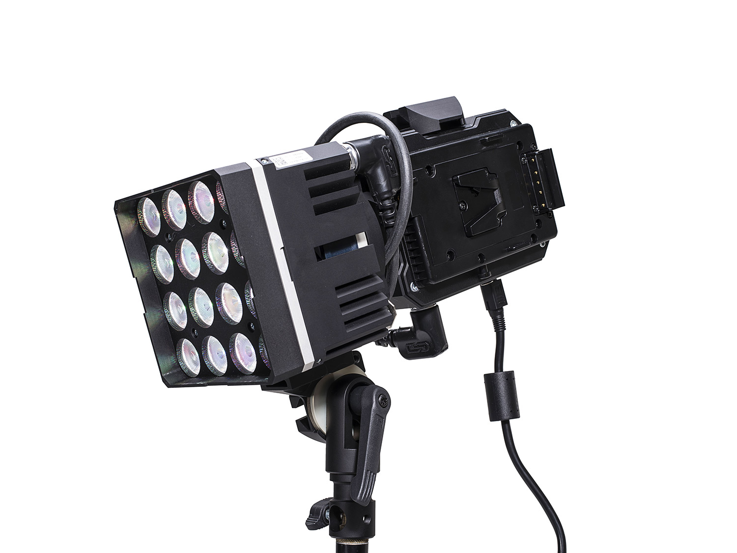 DS1 Set by Digital Sputnik
So that about does it for our lighting, now let’s move to the camera package! This season, we shot on the RED Epic-W. This camera shoots RAW video, which allowed us a ton of flexibility in post-production to correct any color balance issues we might encounter on set. Due to the fast-paced nature of some of our days filming in the kitchens, we often didn’t have time (or space!) to bring in additional lighting, so the extra wiggle room our images gave us also allowed us to focus first on capturing the moment and secondarily on the settings. However, all that RAW goodness comes at a cost! As beautiful as the 8K video (that’s about 35 megapixels for you photographers out there) was looking, we ended up shooting about 75 hours of footage which weighed in at a hefty 50 TERABYTES (no, that’s not a typo). Since there are very few 8K displays are out in the wild, it’s impractical to actually display that full image. However, we were finishing in 4K, which allowed us to stay framed wider on our plated food shots and interviews, and then punch into it in the edit for close-ups without sacrificing resolution. In addition, scaling footage down eliminates noise, which made our low-light situations even more forgiving.
So, now that the technical details are out of the way, I wanted to talk about a few specifics on my favorite interviews from the series! Here they are, along with some handy diagrams!
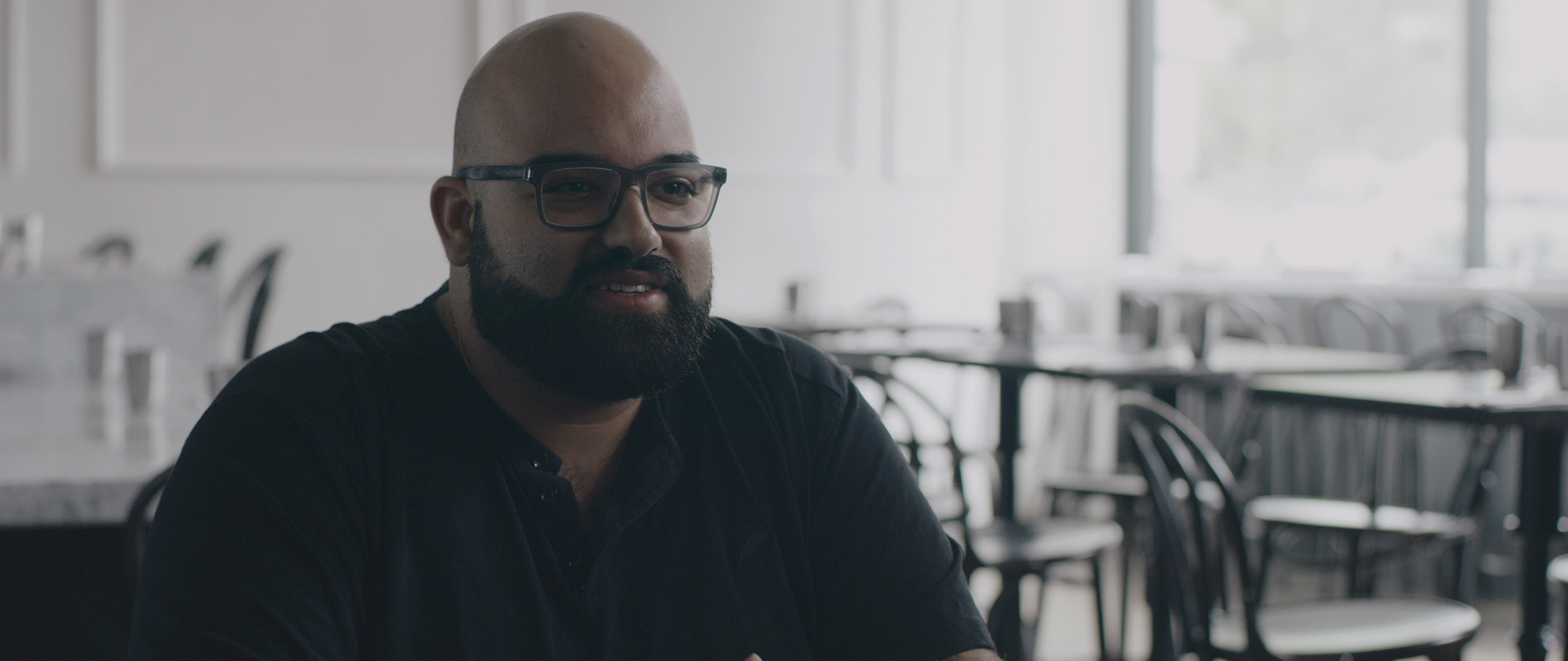
NAKUL – Badmaash
This interview is probably my favorite, but it wasn’t without its struggles. At the time of our shoot, Badmaash was getting some new neighbors! Unfortunately for us, that meant stopping this interview every 5 minutes to hold for the guys next door to stop drilling into the wall. About halfway through the interview, we realized we wouldn’t be able to finish before we needed to move on for the day, so we paused everything and took detailed photos and notes of our exact setup. Two weeks later, we came back in and set up the shot nearly identically (except for some rogue drinks in the background that got shuffled).
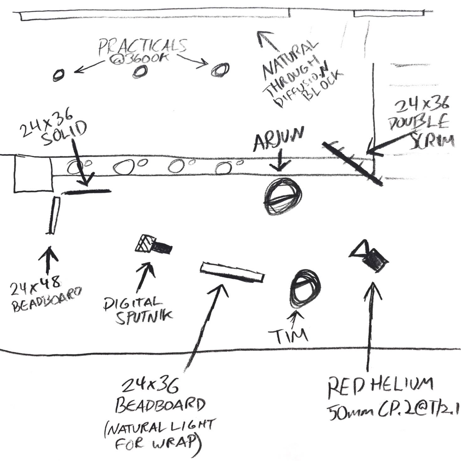
ARJUN – Badmaash
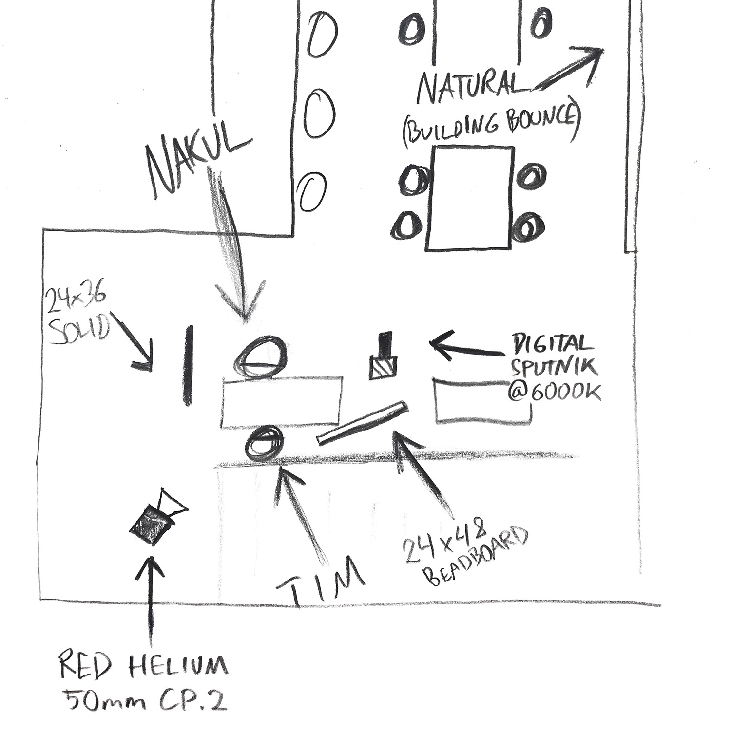
This interview was quite the problem from the beginning! We wanted to shoot both brothers in the dining room of Badmaash, but we didn’t want to have them look too similar, so we decided to move upstairs for Arjun’s. The overhead lights here are warm-tone, which is great for nighttime, but clashed pretty badly with the daytime light that was pouring in from behind. We tried almost every lighting angle imaginable, even giving up on natural motivation, but nothing looked quite right. We finally walked our bounce card just off frame to the left – and in the space, almost behind Arjun – and that little bit of light created a pretty believable wrap around his face. We used a bit of netting (called a double) off frame to the right to soften up some of the natural light hitting his neck, and topped it off with an additional bounce card next to Tim (the director/interviewer) to give us a bit more fill on his face. In the end, I think we ended up with an interview that contrasts Nakul’s, but still compliments it aesthetically.
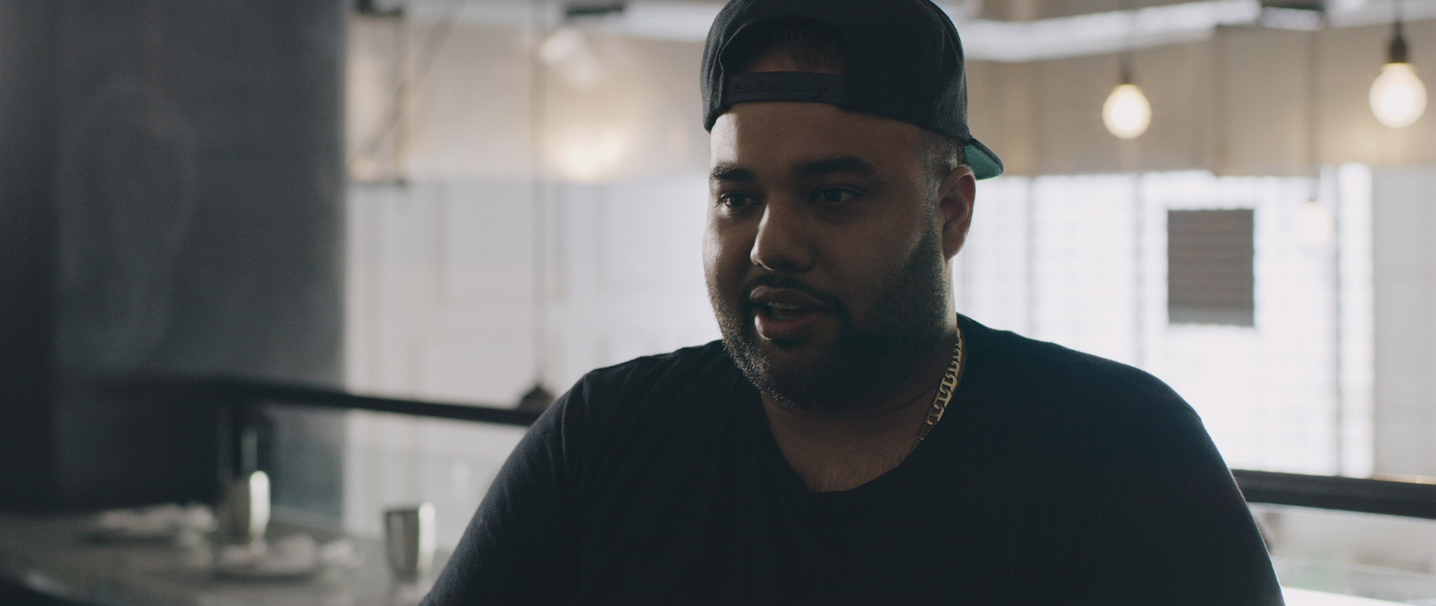
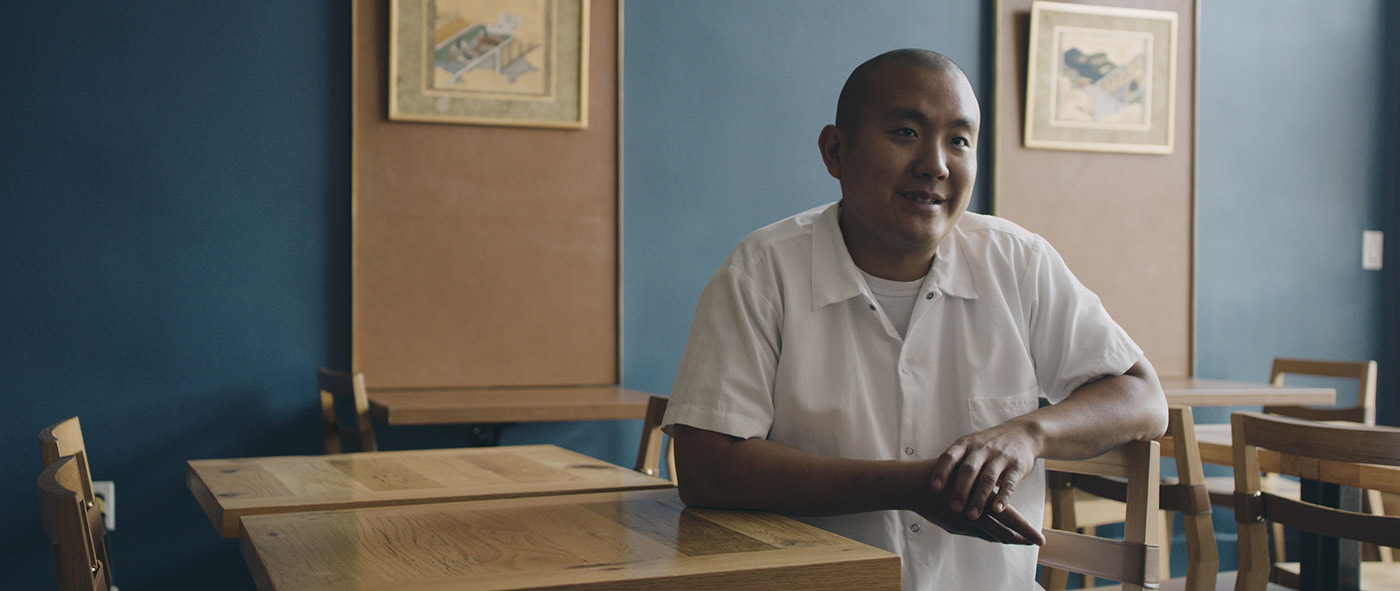
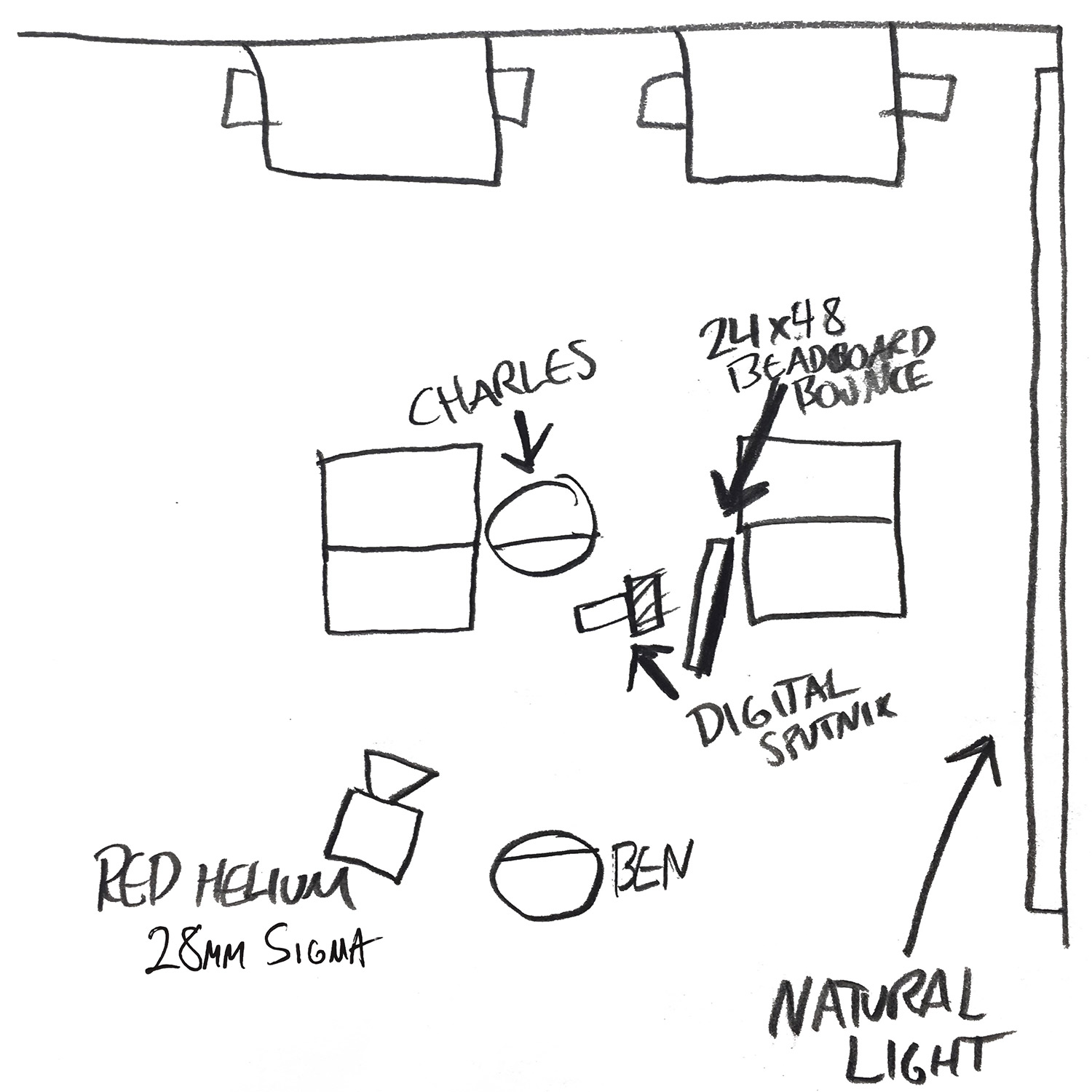
CHARLES – Omotenashi
We got lucky the day we shot the Tsubaki interviews. LA was blessed with some long-lasting cloud cover which gave us some great soft light in their dining room. Ben and I decided to play around with traditional composition here and “shortsight” this interview by having Charles look off screen away from the “longer” side of our frame. We implemented a really simple setup here: Sputnik into our bounce just off frame right, and a black solid just off frame left to create some contrast.
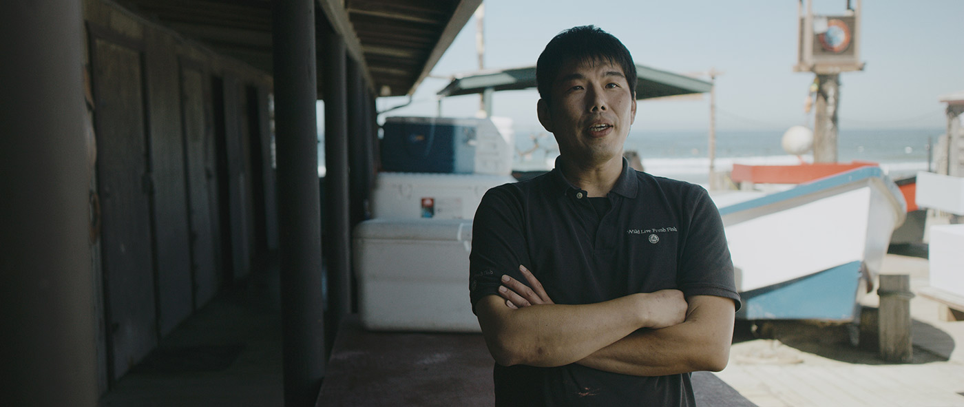
SEIICHI – Omotenashi
This last one is just for fun, because it’s basically all natural. I feel like this is where the dynamic range of the RED really shines. We used our white card pretty far out of frame to bounce some light onto his shirt a bit so it didn’t fall too dark into the shadows, but this is all pure sun. It’s also one of the few interviews that we did standing up! We had a really interesting setup ready to go a couple hours before this with Seiichi sitting in the back of his work truck, but the parking lot was just too noisy for us to use, so we scrapped that unfortunately, but quickly found this frame in the fish market. I think it ended up looking really great!
Thanks for reading, and I hope you’ll check out all of the episodes of Season 2 of The Migrant Kitchen, now streaming at KCET.org.
Our comments section is for members only.
Join today to gain exclusive access.